I have been a fan of Microsoft Office all the way back when Windows 3.1 was the standard operating system and CD-ROMs were the newest “gotta-have-feature” computers. Office has always bombarded users with features and functionalities too difficult to ignore. In those days MS Word, MS Powerpoint, MS Excel were the backbone of the Office Suite, and Microsoft successfully cornered the market. MS Office has been just too powerful to ignore and has been must have productivity software.
Honestly, because I use Google Apps so heavily, I was tempted to opt out of getting Microsoft Office 2010, but after reviewing some of its new features online, I had to give it a try. The version I purchased was the Microsoft Office Home and Student 2010 version with the Family Pack option that allows me to install it on three of my home computers. The current retail price for that package is $149.00. I purchased my version from Office Depot.
The Microsoft Office Home and Student 2010 version actually only has four of the applications offered as a part of Microsoft’s productivity lineup. Home and Student 2010 has MS Word, MS Excel, MS PowerPoint, and MS OneNote. Some would question why I purchased the Office Suite without MS Access, MS Outlook, and MS Publisher. The answer is easy. I honestly never used MS Access. As an administrator I just never had a need to develop databases to use during the course of my job, and I never used it at home. I also never used MS Outlook at home. Let’s face it, with all its bells and whistles, it is an excellent business app, but for my home email use, I just do not need all that stuff. Now, I perhaps will miss MS Publisher a bit. I used it all the time as a classroom teacher. Creating handouts and activity sheets was just too easy in Publisher. But now that I have been in administration, I just don’t use it any more.
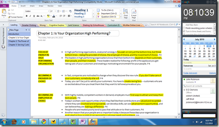
So, what do I like about MS Office 2010 so far. I love the new MS OneNote interface. The design now has the same task button ribbon across the top that all the Office 2007 programs had.
MS OneNote’s 2010 Fluent User Interface
This makes OneNote’s menu items more accessible and easier to find during use. Microsoft calls this user interface “the Microsoft Fluent User Interface.” This makes it easier for users to find and use the functions available in all MS Office applications.
The big plus of MS OneNote 2010 is the ability to now sync OneNote with Windows Live and in turn sync OneNote on my Laptop with OneNote on my desktop. It is now possible to edit OneNote Notebooks using Microsoft OneNote web application. That allows me to use this product on computers that do not have OneNote installed.
One final plus I have found so far is the Windows Live Skydrive feature. I can upload notebooks or any Office documents for that matter and access them with other computers, and even share them with others. (Look out Google Docs.)
I have only tinkered with Microsoft OneNote 2010 so far and I love all the new features. Some of those are:
- Quick styles for creating headings
- Support for mathematical equations
- Docked OneNote
- Information Rights Management (IRM) protected printouts
- Print driver for 64 bit operating system
For more about changes see Microsoft’s site here. I have not fully explored OneNote 2010, so I am sure I will have more to say about it later. I also have not even checked out MS Word, PowerPoint, and Excel 2010.


No comment for "MS OneNote 2010’s Sleek Design and New Features Make It Must-Have Note Taking Software"
Post a Comment